ShopDreamUp AI ArtDreamUp
Deviation Actions
Suggested Deviants
Suggested Collections
You Might Like…
Featured in Groups
Comments46
Join the community to add your comment. Already a deviant? Log In
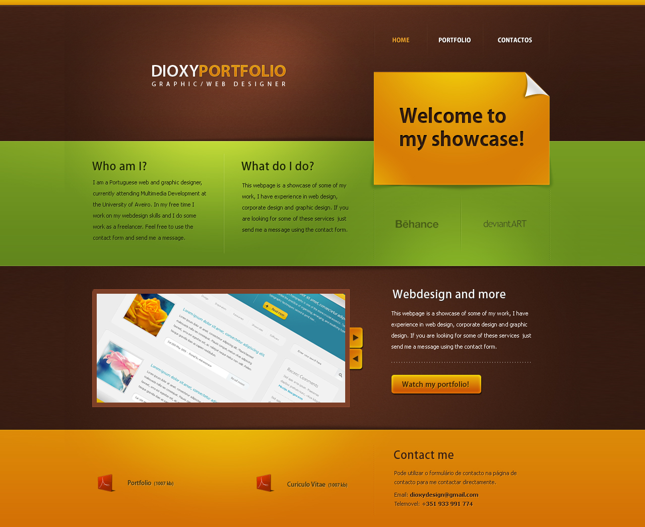
First of all, I really like the color scheme. It seems to be playing on autumn right now, but really, they complement eachother so well, it's visually delicious. I love how well you lined everything up, especially on the right side with the sticker. Also, you have a nice balance on the page of information, downloads, and an image thing that I suppose would scroll through projects and be clickable?
However, as a portfolio site, it's a little disappointing. It looks much like a template site you might sell on wordpress (though not to say those aren't beautiful as well) or another blog/company website. It doesn't really say anything about you, other than you know how to make clean layouts--and you're supposed to be representing yourself, right? I look at this and think "nobody's home", and I think you could put a lot more of yourself into it. It may be trendy right now, and that's what web design is about in some cases, but how about you make it a little more visually interesting in a way that reflects what you can do!
What I really think would help is to have a more interesting logotype---it's not bad, but the thin-thick and then words spaced underneath seems to be a business card default anymore. And I'm not saying you should scrap it either! But again, try making it your own somehow, even if it's a tweak. Little things go a long way, especially when it's the first thing the viewer sees on YOUR PERSONAL PORTFOLIO.
You've got the skills and the talent, man, I can tell just by this layout and the layout in the thumbnail. Flaunt em!


